Components
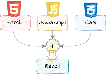
Components are the building blocks of React. Components allow developers to break complex user interfaces into small, reusable and manageable pieces. React components encapsulate JavaScript logic, HTML and CSS styling.
Why components?
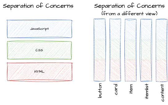
- Reusability - Don’t repeat yourself
- Separation of Concerns - don’t do too many things in one place.
- Each component has one focus
Anatomy of a Component
- A component in React is a JavaScript function that return markup - JSX.
- Function components are defined as regular JavaScript/TypeScript functions.
- We can nest React components to build complex user interfaces.
- Best practice is typically one component per file.
- Components begin with an uppercase letter and use camel case.
- Components can be as small as a button, or as large as an entire page.
Simple Example Component #1
Here's an example react component. This component renders a text element. It meets all the requirements of a react component.
function Greeting() {
  return (
      <h1>Good morning!</h1>
  )
}
export default Greeting;
We can use the Greeting component in another component:
 ...
This is my message: <Greeting />
 ....
.... which would render:
This is a valid React Component, a JavaScript function that returns JSX.
function Greeting() {};. defines a component namedGreeting. It is defined with a JavaScript function and refered to as a functional component.return ( ... );The render method (the function body ) must return JSX, which describes the UI that the component will render.exportmakes the Greeting component available for import and use in other files within your React application.
Simple Example Component #2
Here is another example component. This one renders an image and uses a different JavaScript function syntax.
Notice that this component is defined with a JavaScript arrow function.
const Profile = () => (
  <img
    src="/img/react-buzz-lightyear.png"
    alt="Buzz Lightyear"
    width="100px"
  />
)
export default Profile;
We can use the Profile component in another component:
 ...
This is a <Profile /> pic!
 ...
to render:
 pic!
pic!Declarative Approach
React follows a declarative approach, rather than imperative.
-
With imperative code, you provide all instructions step by step. You select the element, manipulate the DOM, etc.
-
In a declarative approach, you define the target state(s) and let React figure out the DOM instructions. In other words, you don’t enable, disable, show, or hide components directly. Instead, you declare what you want to show or render, and React figures out how to update the UI.
React: Declarative vs Imperative
Importing and Exporting Components
Typically, each React component is defined in a separate file that can be
- Exported for use by other components
- Imported in the file where you'll use the component
- only one default export allowed per file. If you set a
defaultexport, then you canimportthe component without curly braces.
For example, without setting default, we export the component when we define it so that we can use it in other components:
export const Greeting = () => (...)
We use {} to import Greeting:
import { Greeting } from './Greeting';
If we set Greeting as the default component:
const Greeting = () => (...);
export default Greeting;
No {} are needed on import:
import Greeting from './Greeting';
Styling Components with Tailwind CSS
CSS styling is added to components with the keyword className. You may create custom CSS and use the custom classes with the className attribute or use Tailwind utility classes as in this example.
export function DSGreeting() {
  return (
       <div className="m-12 flex h-[500px] flex-col items-center justify-center bg-green-400 text-center text-3xl p-12 md:p-14 lg:p-16 xl:p-20">
           <h1 className="mb-4">Good morning!</h1>
           <p>Glad you are here.</p>
       </div>
 )
}


This is my styled greeting: <DSGreeting />.
Tailwind CSS is included in the environment we created when we installed next.js. You may simply use it in your components.
Live Component Example
Explore the component syntax in the live code editor below. Add some Tailwind CSS and see how it looks. What happens if you don't close the tag? Forget the return?
function Welcome() {
  return <h1>Hello, student!</h1>;
}