Grid Layout
CSS Grid is a powerful layout system that allows you to create two-dimensional grid-based layouts with ease.
Grid provides a flexible and intuitive way to arrange elements in rows and columns. Grid is often referred to as a two-dimensional layout system. This is somewhat true but reminds us that the strength of Grid is aligning rows and columns.
Grid
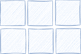
- is an addition to CSS
- define the parent element as a grid container
- each block-level child in a grid parent container is placed into a grid cell
grid-template-columnsis used for adding columns by specifying each column’s width using thefrunit.
    display: grid;
    grid-template-columns: 1fr 1fr 1fr;
.container {
	display: grid;
	gap: 10px;
	grid-template-columns: 1fr 1fr 1fr;
}
Grid Properties
display: grid- Define a container element as a gridgrid-template-columnsandgrid-template-rows- set the column and row sizesgrid-columnandgrid-row- place child elements
To demonstrate, we have five box divs, each 100px x 100px. By default, each box occupies the whole width of the container (divs are display block) so the next box resides on the next line.
   <section class="grid-container">
        <div class="box1"></div>
        <div class="box2"></div>
        <div class="box3"></div>
        <div class="box4"></div>
        <div class="box5"></div>
    </section>
With the display set to grid and the layout is a column a row of boxes.
.grid-container {
	display: grid;
}
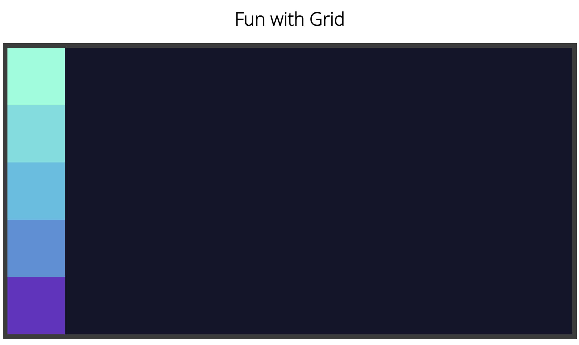
We set a three-column layout with grid-template-columns: 1fr 1fr 1fr.
.grid-container {
    display: grid;
	gap: 10px;
	grid-template-columns: 1fr 1fr 1fr;
}

See CSS Grid Layout Guide for a great reference on grid layout.
Try Grid
Try grid in the sandbox! In this example, the class grid-container
is the parent container so the boxes take on the grid properties set for the child divs. The divs are display:flex so that we can use the flex properties justify-content and
align-items to center the letters of the divs.
Modify the code below and see the live browser output: