Flexbox
CSS Flexbox is a powerful layout system that allows you to create flexible and responsive page layouts.
It provides a convenient way to distribute space among items in a container, align them, and
control their order. You will often see Flexbox referred to as a one-dimensional layout
system. That is not totally accurate but it does help to remember what the strength of Flexbox
is - aligning items within a row or column.
Flexbox
- is an addition to CSS
- a layout method that providex a flexible way to arrange items within a container
- distributes space dynamically across a device of unknown size - “flex”
The flex display property creates a flexible parent container for arranging the child elements. Make the parent element the flexible container:
display: flex;
The children become the flexible items.
Flex Container
The flex display property works on the parent child relationship. Set the parent element
to display:flex and the children take on the flexible arrangement.
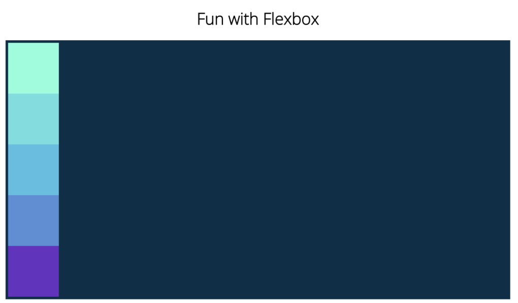
To demonstrate, we have five box divs, each 100px x 100px. By default, each box occupies the whole width of the container (divs are display block) so next box resides on the next line.
   <section class="flex-container">
        <div class="box1"></div>
        <div class="box2"></div>
        <div class="box3"></div>
        <div class="box4"></div>
        <div class="box5"></div>
    </section>
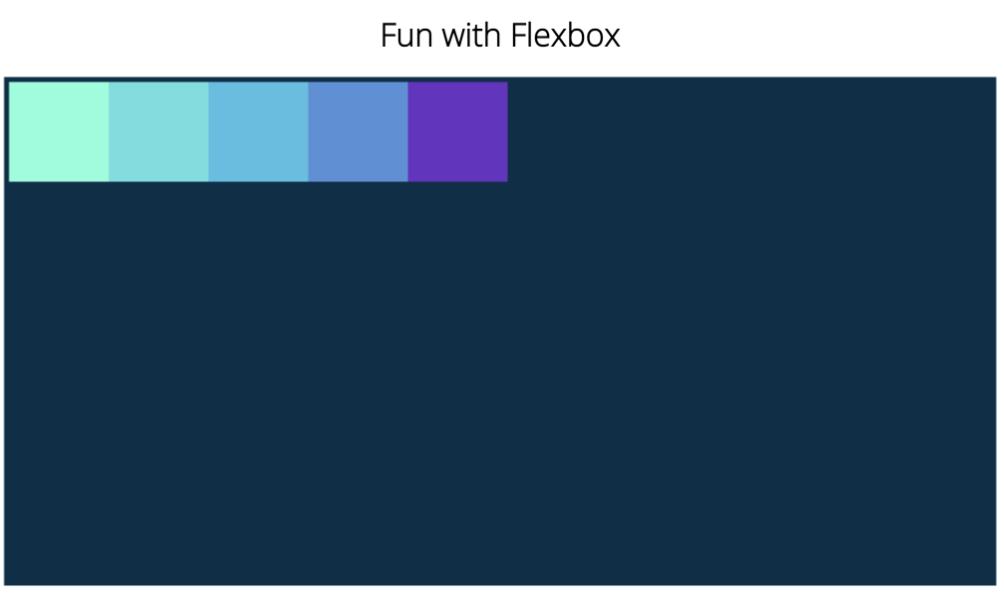
Turn on flex. Set display to flex and the layout switches to a row of boxes.
.flex-container {
	display: flex;
}
Flex Direction
By default, flex works from left to right. The main axis is horizontal and a cross axis is top to bottom. We
can change the direction with the flex-direction property. flex-direction sets the direction for
the main axis. The default flex-direction is row. We can change the default by setting
the flex-direction property on the flex container to:
- row-reverse
- column
- column-reverse


Note that the boxes take up the height of the container.
Justify content
justify-content is a property that can be set on the flex container to select where the flex items line up along the main axis.





Flex wrap
By default, flex forces all child elements on one line. You can allow child
elements to wrap onto multiple lines with the flex-wrap property.
flex-wrap: nowrap; /* default - force on one line */
flex-wrap: wrap;  /* allows wrapping to next line */

Flex sizing
Flex sizing properties are for individual items in a container and control how they grow or shrink when there is space available or when there is too little.
flex-basis- defines the initial size of an element before additional space is distributed.flex-growcontrols how much or available space an element should take up. Accepts a number value.flex-shrink- items that don't fit shrink to fit
.flex-container div {
   flex-basis: 100px;
}

.box1 {flex-grow: 1;}
.box5 {flex-grow: 2;}

Flex Gap
The gap property defines the size of the gap between the elements of the flexbox layout.
.flex-container {
  gap: 25px;
}
See CSS Flexbox Layout Guide for a great reference on Flexbox layout.
Try Flex
Try flex in the sandbox! What happens if you set flex-wrap? In this example, the class flex-container
is the parent container so the boxes take on the flex properties set for the child divs. However,
the divs also are display:flex. This is so we can use the flex properties justify-content and
align-items to center the child elements of the divs. What are the children?
Modify the code below and see the live browser output: