Tailwind CSS
Tailwind CSS is a CSS framework that allows you to build user interfaces in your HTML or JSX by applying small, single-purpose classes. With Tailwind, instead of writing custom CSS styles in separate files, you use predefined class names to style elements inline.
Unlike other CSS frameworks like bootstrap, Tailwind CSS does not provide highly designed UI components like buttons or cards but instead it provides low level utility classes that let you build custom designs directly within your HTML or JSX. These utility classes are single purpose classes that can be directly applied to HTML or JSX elements.
Tailwind is built on top of CSS so you need a basic understanding of how CSS works to use Tailwind.
Reasons to use Tailwind:
- efficiency, builds are efficient and creation is quick
- customization, easy to customize on the pre-built classes or create new classes
- performance, faster than regular CSS because it eliminates unused classes
More on Tailwind
- Reference this Tailwind documentation for a list of Tailwind classes.
- Consult this Tailwind Cheatsheet for a quick reference on Tailwind classes.
Install these VSCode extensions to aid development with Tailwind:
- Tailwind CSS Intellisense
- Prettier prettier-tailwind-CSS
Responsiveness
Tailwind has utility classes sm, md, lg, xl and xxl for achieving responsive layouts. For
this section, we change the amount of padding based on the screensize displayed on. The viewport meta
tag in <head> is required for the breakpoints to work:
<meta name="viewport" content="width=device-width, initial-scale=1.0" />
If you want to use a breakpoint prefix to target a single breakpoint, you just need to add the prefix followed by a colon ( : ) and then the class name you want to assign to the prefix.
For example, mobile first (stack pic over heading and text):
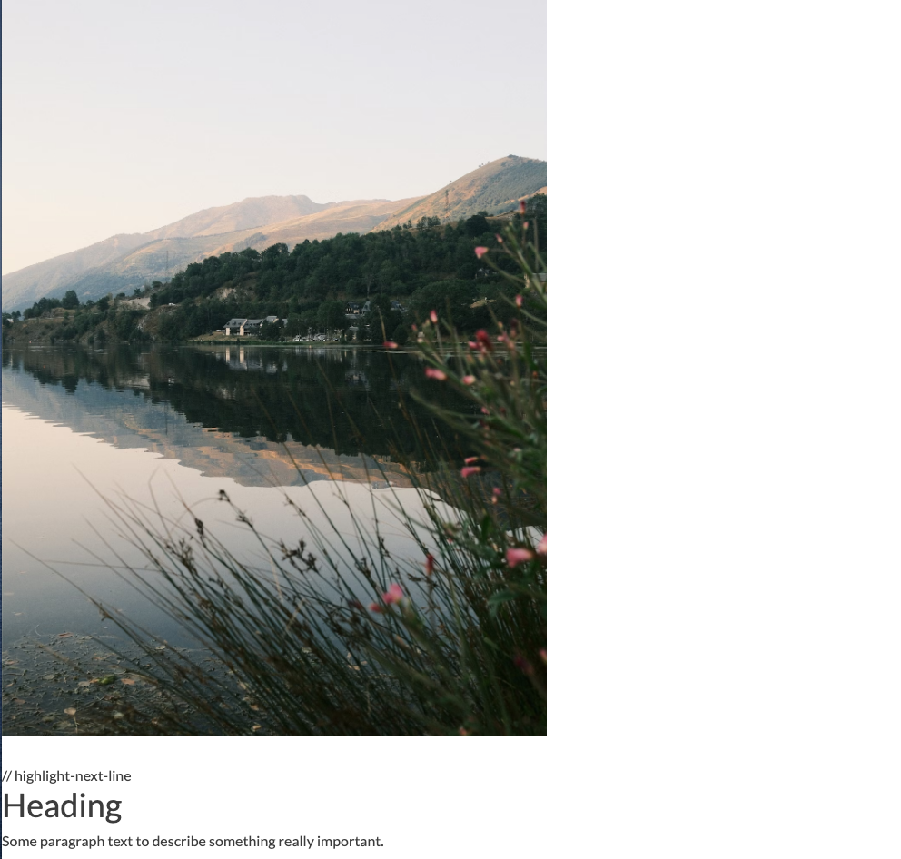
      <section class="grid gap-8">
        <div>
           <img src="images/mtns.jpg"" alt="pic" />
        </div>
        <div>
            <h2 class="mb-2 text-4xl font-medium">Heading</h2>
            <p>Some paragraph text to describe something really important. </p>
        </div>
      </section>
Then to make it change to side by side (image beside text):
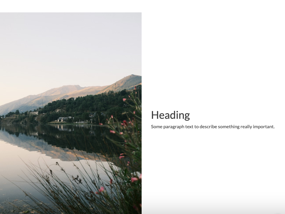
      <section class="grid gap-8 md:grid-cols-2 md:items-center md: text-left">
        <div>
          <img src="images/mtns.jpg"" alt="pic" />
        </div>
        <div>
            <h2 class="mb-2 text-4xl font-medium">Heading</h2>
            <p>Some paragraph text to describe something really important. </p>
        </div>
      </section>
Tailwind follows a mobile first breakpoint system, so the unprefixed classes control the
mobile layout and the md: classes control 760px and above.
Create the mobile design first and then adapt it
for larger screen sizes by using breakpoints. The breakpoints represent the minimum width and up.
The prefixes are: sm, md, lg, xl and 2xl.
Default Breakpoints
There are five breakpoints preset in Tailwind. These follow common device sizes:
Breakpoint prefix	Minimum width	CSS
sm	40rem (640px)	@media (width >= 40rem) { ... }
md	48rem (768px)	@media (width >= 48rem) { ... }
lg	64rem (1024px)	@media (width >= 64rem) { ... }
xl	80rem (1280px)	@media (width >= 80rem) { ... }
2xl	96rem (1536px)	@media (width >= 96rem) { ... }
The default screen sizes can be changed in the config file.
Breakpoint Range
You can target a range of breakpoints with specific styles. For example, for the sm: breakpoint up to the xl:
breakpoint, I can use:
sm:max-xl:bg-blue-50 sm:max-xl:p-9
This means from the mobile breakpoint up to the start of the xl breakpoint blue color and padding.
<section class="m-12 flex h-screen items-center justify-center bg-green-400 text-center text-3xl
            p-12 md:p-14 lg:p-16 xl:p-20">
Tailwind in React
Tailwind fits naturally into React’s component-based architecture and is easily installed as part of a React Nextjs installation:
-
You define styling inline with JSX
-
No need for external CSS files or class names (unless desired)
-
Highly responsive and fast to prototype
Example React Component
The code below creates a React Button component that uses Tailwind utility classes for padding color and hover state.
export default function Button() {
  return (
    <button className="px-4 py-2 bg-green-600 text-white rounded hover:bg-green-700">
      Click Me
    </button>
  );
}
Customize Tailwind
You may customize Tailwind values in the tailwind.config.js file. In this file you can change
color values, add custom values, etc.
     theme: {
        extend: {
            colors: {
                "twitter-blue": "#1DA1F2",
            },
        },
    },
    plugins: [],
To add custom CSS rules to a Tailwind project, one approach is to edit the index.css file.
@tailwind base;
@tailwind components;
@tailwind utilities;

* {
    font-family: "Times New Roman", Times, serif;
}

@layer components {
    .card {
        display: flex;
        align-items: center;
        justify-content: center;
        width: 300px;
        height: 100px;
        background-color:theme("colors.twitter-blue");
        border-radius: 8px;
        border: 0.7px solid #eee;
        box-shadow: 0 4px 10px -1px rgba(0, 0, 0, 0.1),
        0 2px 6px -2px rgba(0, 0, 0, 0.2);
    }
}
This will change the font of the whole site to Times New Roman and create a new class card. We can now use class card in a component:
 import "./App.css";

 const App = () => {
    return (
        <div>
          <div className="card">This is a card.</div>
        </div>
    )
 }
 export default App;